A limited palette for acrylic painting can start with ultramarine blue, yellow ochre, burnt sienna, and titanium white. Together they can make a pale sky, a cool blue-gray ridge, a muted green field, and a dark foreground. Mix those four colors in small piles, compare how light and dark the mixtures are, and test a little paint after it dries before committing to the canvas.
This tutorial is for a beginner who can put paint on a brush but gets lost once several colors meet. The worked example is a small landscape with three large shapes. By the end you will have a set of mixtures you can reuse, plus a way to diagnose a painting that looks flat or muddy.
Choose four tubes for a specific kind of picture
Ultramarine gives you a cool starting point for sky and shadow. Yellow ochre supplies a subdued yellow that can steer a mixture toward grass or sunlight. Burnt sienna provides a warm earth color and can tame the blue. Titanium white lightens mixtures and makes the pale notes easier to build.
This is an earth-toned landscape palette. It suits blue hills, dusty fields, stone walls, and warm clouds. A high-chroma tropical scene calls for different ingredients. If your reference depends on brilliant green leaves or a bright pink sunset, decide whether a quieter version still captures what drew you to it before you put paint down.
Have a small panel, a flat brush, a smaller brush, water, a cloth, and a palette knife or an extra mixing brush. A scrap of the same primed surface gives the most useful swatch comparison. If you need help setting up the surface and brushes, start with the beginner’s guide to acrylic painting.
Build three values before mixing every color
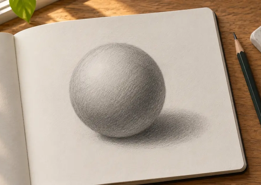
Value means how light or dark a color appears. Make three rectangles on scrap paper with a pencil or three gray mixes. Assign the lightest to the sky, a middle value to the ridge, and the darkest to the foreground shadow. Leave the individual trees and clouds out of this exercise. The three big shapes should already read as a landscape.
Squint at the reference or take a grayscale photo of your thumbnail in even light. If the hills and field merge, adjust one of the big shapes now. A light strip of grass can still sit within the darker foreground group. Think of each group as a neighborhood of values with one clear job.
Keep the original thumbnail beside the canvas. When a mixture turns out prettier than expected, compare it with the drawing before using it. A lovely pale green may belong on the sunlit edge of a field while being too light for the main shadow. The thumbnail helps you place the color where it earns its keep.
Mix four starting piles and keep a reserve
| Area | Starting mixture | Adjustment to try |
|---|---|---|
| Sky | Titanium white with a little ultramarine | More white for a pale horizon |
| Ridge | Ultramarine, a touch of burnt sienna, and white | A little more blue for distance |
| Field | Yellow ochre with small additions of ultramarine | A trace of sienna for dry grass |
| Deep shadow | Ultramarine and burnt sienna | More blue for a cooler dark |
Start each pile with the dominant color. Move a small amount to a fresh spot and add the stronger ingredient with the tip of the knife. Mixing in a separate spot leaves an escape route. If your ochre turns blue too quickly, the untouched pile is still there and you can try a smaller addition.
These mixtures are starting points. Paints with the same name can behave differently across ranges, and an opaque white can change a mixture fast. For a dark that leans too orange, test a dab of blue in a portion of the pile. For a cool mix that feels too harsh, try sienna in a portion.
Mix a little extra for any area you plan to cover twice. Put a clean small pile aside for the second coat. Rinsing a mixing brush between colors and drying it on a cloth keeps stray paint and excess water from sneaking into pale mixtures. A palette knife makes it easier to see how much of each ingredient you added.
Use a two-swatch dry test
Paint two neighboring patches of the ridge color on scrap. Use the current mix for the first. For the second, add a little white to a separate dab, keeping the blue and sienna balance as close as you can. Apply both patches at the thickness you intend to use. A thick blob and a thin brushstroke make a poor pair for comparison.
Let the patches dry, then hold them next to a dry sky swatch in the same light. Acrylic color can shift as it dries, an effect discussed in GOLDEN’s notes on paint color measurements. If the two colors nearly merge, choose the darker ridge patch or adjust it further. If the ridge jumps forward too strongly, test the lighter patch.
Keep the test card after you finish. Record the paint names and put a pencil dot next to the mix you used. That small record gives you a reliable reference when you return tomorrow. It also helps you tell whether a different result came from a different mixture, a change in lighting, or a different surface.
Paint a three-value landscape from sky to foreground
Set the sky and ridge relationship
On a small panel, put the horizon a little above the middle and mark one ridge line. Lay a light blue-gray across the sky. To suggest light at the horizon, mix a little more white into a portion and blend the transition while the paint is workable. Then let the sky dry and place the middle-value ridge with a flatter brush.
Give the dark foreground one clear edge
Imagine the field slopes up from the lower left toward a sunny corner on the right. Lay the main ochre-green shape, then mix a darker strip for the lower edge with ultramarine and sienna. Leave a small opening of lighter grass near the right corner. That opening gives the viewer a place to enter the picture without adding a path or fence.
Now check the painting in grayscale. Suppose the grassy strip is almost as light as the sky and takes over. Paint over part of it with the middle field mixture and leave a smaller bright patch. The resulting picture keeps its light sky, quieter ridge, and dark foreground. A single controlled adjustment has restored the shape you planned.
Fix a muddy mixture by finding what changed
If a green looks muddy, decide whether the problem is its hue, its value, or its placement. A muted green that looks dull on a white palette may look just right beside a blue ridge. Paint a dab next to its intended neighbor. If both dry to similar values, make one lighter or darker before trying to mix a brighter green.
If an area looks chalky, check how much white you added. Try a cleaner mixture with less white for a darker neighboring passage. For a sunlit edge, test a warmer light made from ochre and white. You can keep the original light and use the second mixture only where the warm shift helps explain the shape.
Repeated strokes over half-dry paint can pull the previous color into the new one or leave a rough surface. Let the area dry, remix a clean pile, then paint the new shape in a few deliberate strokes. If the surface itself is the trouble, this canvas painting guide covers beginner setup and handling.
Repeat the study with one deliberate change
Make another thumbnail of the same landscape and shift the light from the right corner to the left. Keep the four tubes and three-value map. Change where the light grass meets the foreground shadow, then check whether the eye follows the new route. Repeating the scene saves drawing time and makes the effect of that single change easier to see.
If the palette kept you from painting something you cared about, add one tube for the next study and give it a specific job. A brighter yellow might lift a sunlit leaf. Make a row of dried comparison swatches before using it. You will know exactly what the extra color contributes because you have the first painting and its test card beside you.